Loading...
A new brand for
BreastScreen Victoria
BreastScreen Victoria
New colour and energy to help beat breast cancer.
Deliverables
Brand guidelines
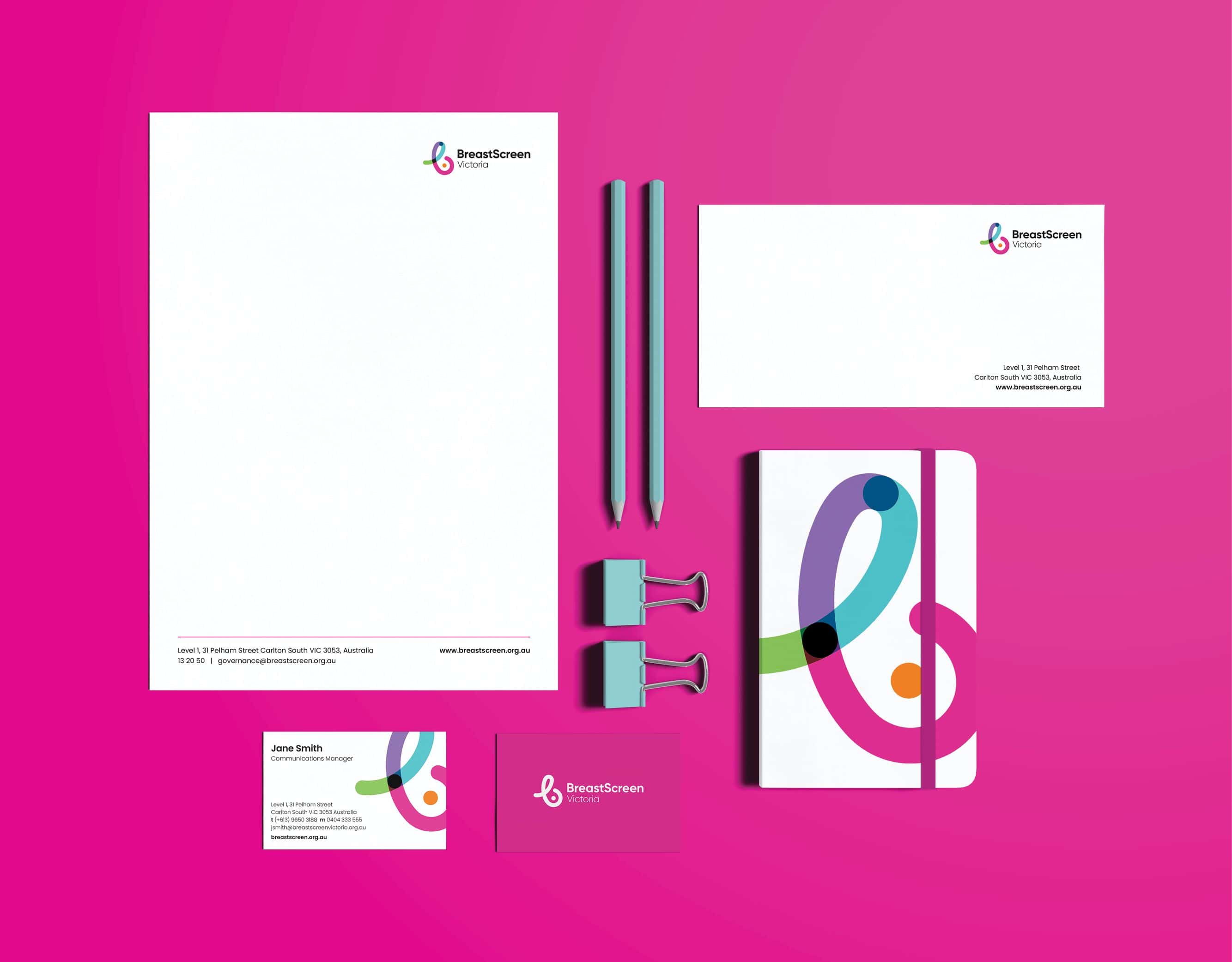
Brand assets
Branded templates
Early detection is one of the best tools we have to tackle breast cancer. It’s why every year BreastScreen Victoria assesses over 250,000 people. That’s 45% of women aged 50 – 74.
So while brand recognition and adoption of services was high, there’s always a drive to do more.
Our research found that after 15 years, the branding felt dated. It lacked a sense of diversity and inclusion, and an obvious link to their purpose was missing.
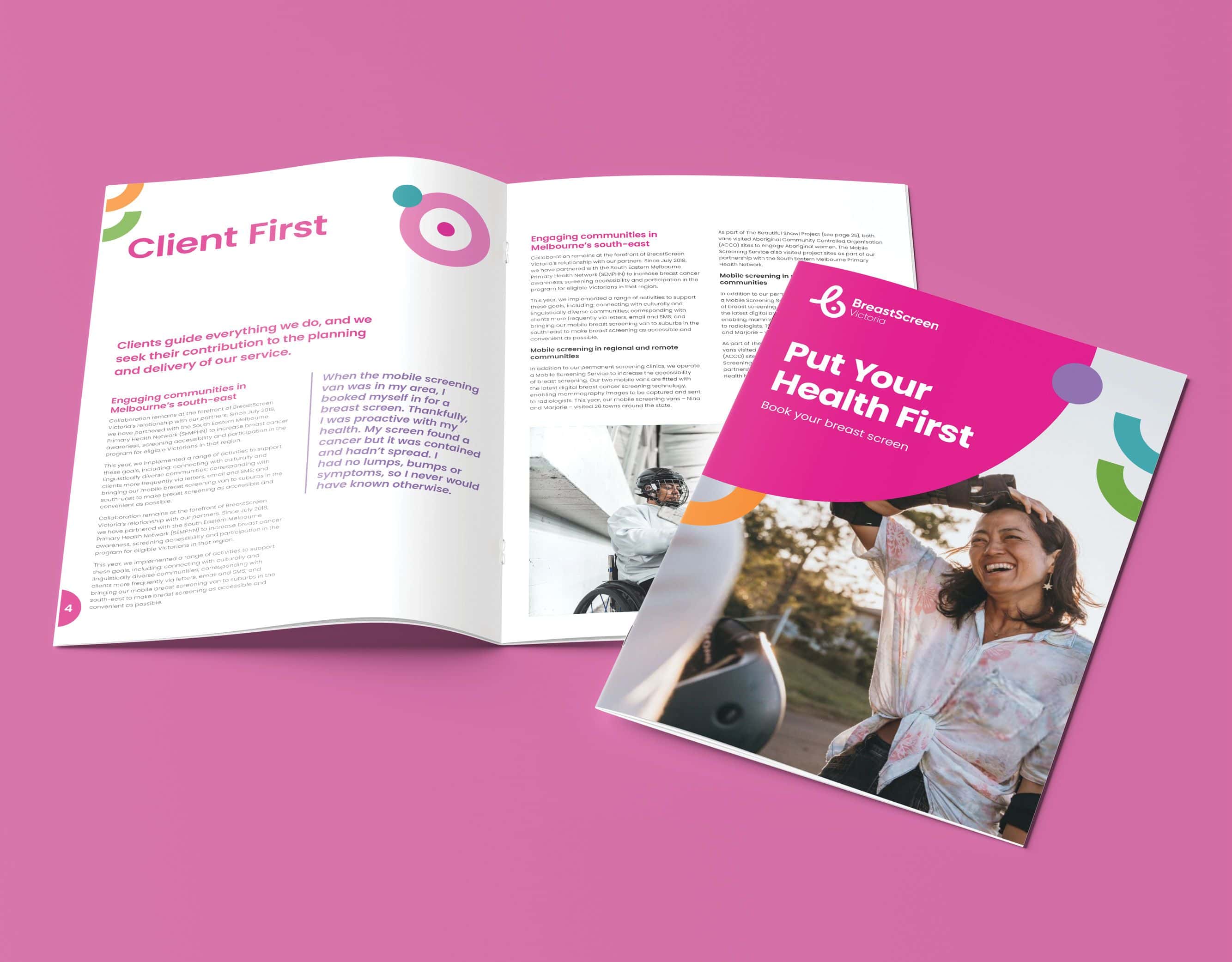
Bright, fluid and welcoming, we created new iconography, typography and graphic devices for the brand.
An overhaul of BreastScreen Victoria’s logo now features organic, flowing lines inspired by their work. The imagery is ownable to the brand, and communicates their purpose.
Colours inspire positivity and make the brand feel more accessible. With soft edges full of movement, the identity is friendly and energetic.
All to inspire positive associations with BreastScreen Victoria, and empower more women take charge of their wellbeing.
